I have added a strip of colour at the bottom of the magazine, which brings it to life as predominantly the colours are dark and somber. The colour also connotes femininity, lipstick and candy floss as my target audience is female teenagers.
Here I have added more writing; I have used words such as 'fab' and 'celebs' in order to connote youth and relate to my target demographic of teenagers aged 15-18 years old. Further on in my designing process I will include direct motive address such as 'you' and 'you'll', as this will enable me to connect to my target audience.
I have also produced a barcode using 'www.dafont.co.uk' as any type of magazine features a barcode which is one of the main features.
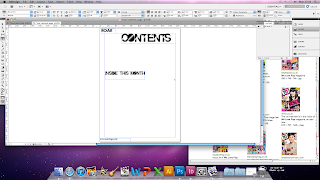
Here I have began to develop my contents page; I have used fonts which I think are appropriate and connotes a current style and youth. I have also written the masthead in the top left corner of the contents page, this will produce a brand identity for my magazine.
I have also started to include some photograph which I have taken in my own time. Further on in my development I will incorporate a variety of images to compose a professional and visual magazine, as I have learned from my research that pop magazines have a wide variety of images.
I have added more pictures that connote fun and youth, I have added the headline of my magazine in the top left corner of the contents page.
I have rearranged the picture to produce a more professional aesthetic to my consents page. In addition I have started to add some page numbers in the 'inside this month' box.


No comments:
Post a Comment